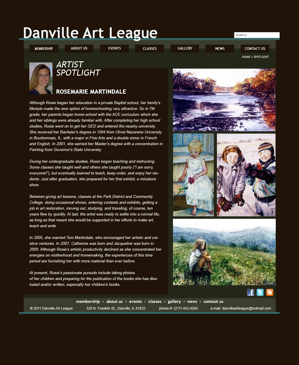
After lots of good feedback in today's class, here are the latest updated Photoshop mocks. To lessen the boxy look but keep my original idea, I've redesigned some of these boxes to have the same color as the main background. The three headlines now seem to fill in an empty hole in the background, instead of laying on top of another box.
Also, the hierarchy's more defined here. In the previous mockup, I had everything at about the same size. Now, the artist spotlight's featured more prominently, with the headlines shrunk down a little as well.
The navbar's also got some color changes, as I've dumped the teal look in favor of another eye trick, making the little navbar items appear to fill in more background holes.
The artist spotlight page has also been tweaked, with the artwork grouped a little better and larger as well dumping a few decorative boxes. I've still got a lengthy bio copy, but I don't know if making this a two-column div will make the text too small here.