Wednesday, November 30, 2011

The Final Two Logos

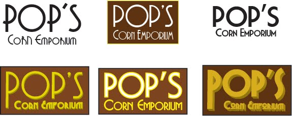
Honestly, I could spend another week just tweaking this thing endlessly, so I'm gonna step back and say that I'll go with one of these two variations and be done with it.

The only difference between the two options here is the depth of the letters. I might even take the deptho f the POP'S from the first one and use the Corn's Emporium depth from the second one.

Still more tweaks

Now I see why people get paid just to make logos for companies... so many small tweaks here and there changes the whole feel of it.

So here are some variations on what I thought might have been the final logo. I'm liking the top right one... for now.

Possible Final Logo


I think we're getting closer. The font's good, the spacing's good... now it's just wondering about the exact colors and thickness of the letters.

Updated Logos


I'm trying to get the logo to have a feel of antiquity with a touch or modernism... ugh, did that sound pretentious.

Take two... I want something that looks cool, new and old at the same time.

These particular fonts are of the Art Deco variety, which would relate to the store's being in business since the 1930's. As for the color scheme so far, I'd like to use colors that resemble popcorn kernels, so maybe that's too "been there done that", but hey, I'm new at this.

Total Redesign For Pop's Corn Emporium


So the original idea of having a sparse, white home page with 7 or 8 popcorn kernels for Pop's Corn Emporium... that wasn't working, as it was too minimal for this particular company. I needed to show more humanity, love, familiarity, etc.

So here's the updated home page - a complete redesign. I really like having the idea of putting the navbar into the overhang. The little dots in the navbar will actually be popcorn kernels, and when you roll over each kernel, you'll get a big, white piece of popcorn.

The storefront look gives me the nice option to put the homepage divs containing the deals, specials, new flavors, etc., into the actual storefront windows.

I'm still wondering what to do with the sidewalk section. I might reduce the perspective of this and make it thinner, and possibly use this for the footer instead of putting the footer into the curb like I have now.

I want to keep the size of all the pages a consistent height and width, so I'll need to use scroll bars for the content pages. When the user goes to these second-level pages, a larger box will take the place of the previous storefront window panes from the homepage.

Sunday, November 20, 2011

Gettin' Those Logos To Pop


After perusing through, oh, about 200 different fonts, I started playing around with the various ones you see here. I'm hoping to show the class these different ideas and get some good feedback on what catches their eye, what colors work and what don't, and what I can improve and retouch until I get just the right one.

Monday, November 14, 2011

Pop's Corn Emporium - 1st Homepage Wireframe

Here's my initial idea for the homepage for Pop's. I'd like to try out some animated stuff here and "pop" the kernels out from the screen if I can.

This is almost definitely too minimal a wireframe at this point, as I'm wondering if I need some kind of info at the bottom for any kind of footer. I'll likely skip using any boxlike elements for the site and keep things animated and "popping", of course.

Wednesday, November 9, 2011

Pop's Corn Emporium - Sitemap


The sitemap for Pop's won't be as complex as the one for the Danville Art League. Just keep things simple - products, history, locations, ordering online. No real need to make this site any more complicated than it has to be.

Project 2 Design Brief - Pop's Corn Emporium

For the second project in our web design class, I'll be researching, wireframing, and developing a website for one of my favorite (and OK, entirely fictional, but have fun with this) popcorn shops in the area:

Pop's Corn Emporium, in the historic downtown section of Geneva.

Now before we delve into design details, it's good to know the history of how Pop's Corn came to be, so let's check out Pop's history...

HISTORICAL BACKGROUND

Around the turn of the 20th century, Gilbert and Rosemary St. Germaine owned an expansive farm in northeastern DeKalb County, Illinois, northeast of the town of Sycamore. While Sycamore was known in those times as a manufacturing center - among Sycamore's early industries were Marsh Harvester Manufacturing, R. Ellwood Manufacturing, and Sycamore Preserve Works - the St. Germaines knew one thing, and one thing well... how to grow corn.

Gilbert and Rosemary's vast knowledge of growing different varieties of corn in DeKalb County was extremely helpful to other farmers in the area, and the St. Germaines were more than happy to share their expertise in farming matters to their neighbors. While many local farmers at that time would keep their secrets, well, secrets, Gilbert and Rosemary wanted the whole region to prosper, and prosper it did.

With the creation of the DeKalb County Farm Bureau in 1912, one of the first organizations of its kind, the entire corn crowing region of DeKalb County grew and strengthened, and the St. Germaines were at the heart of it. Little did they know that their generosity would be repaid in a huge way a few decades later.