 Another day, another update. Here's a modified version of the Millennium Dance Center sitemap. Instead of having the calendar and class schedules on separate pages, I'll feature them in modules on the home page. There's also a newsletters link, which is currently hid in their twitter feed.
Wednesday, January 25, 2012
MDC Sitemap Tweak
Another day, another update. Here's a modified version of the Millennium Dance Center sitemap. Instead of having the calendar and class schedules on separate pages, I'll feature them in modules on the home page. There's also a newsletters link, which is currently hid in their twitter feed.

Monday, January 23, 2012
New classes, new projects.
Alrighty, we're finally in the home stretch of classes here at College of Dupage. I've just started Design 3 and Web Design 2, and completing these two will wrap up the web design certificate.
Our first project in Web Design 2 is to develop a new web site design or retweak an existing one. I wanted to get out of my comfort zone of trying something easy, so I'm gonna try and redesign my daughter's dance studio website, www.mdancecenter.com.
The site as it is now is OK... but it's just OK. I'd like to keep the entire page above the fold, and definitely add video of various classes, recitals, etc. Right now there's not a single video clip on the site, and not much in the way of pictures, either.
The design brief's done for Millennium Dance Center, and here's a sitemap I've got:

The Design 3 class should be quite interesting, as much of the focus is on logos. Letter-based, pictorial, abstract, logotypes... pretty cool stuff. After a small project where we collected a variety of logos and cut and pasted them onto boards, the project we're on now involves taking just our initials and using them to create logos for a bar, restaurant, comedy club, toy store, sports team or fitness club. We're to try out ideas for all six types of companies and then narrow them down to our two best and brightest. I'll post my initial sketches later.
Our first project in Web Design 2 is to develop a new web site design or retweak an existing one. I wanted to get out of my comfort zone of trying something easy, so I'm gonna try and redesign my daughter's dance studio website, www.mdancecenter.com.
The site as it is now is OK... but it's just OK. I'd like to keep the entire page above the fold, and definitely add video of various classes, recitals, etc. Right now there's not a single video clip on the site, and not much in the way of pictures, either.
The design brief's done for Millennium Dance Center, and here's a sitemap I've got:

The Design 3 class should be quite interesting, as much of the focus is on logos. Letter-based, pictorial, abstract, logotypes... pretty cool stuff. After a small project where we collected a variety of logos and cut and pasted them onto boards, the project we're on now involves taking just our initials and using them to create logos for a bar, restaurant, comedy club, toy store, sports team or fitness club. We're to try out ideas for all six types of companies and then narrow them down to our two best and brightest. I'll post my initial sketches later.
Sunday, December 4, 2011
Homepage Artistry...

Since I'm dealing with a fictitious store, there's no actual storefront to shoot a picture for the basis of my homepage idea, so finding the right image online was HUGE... after a bit of searching, I came across a pic of a lonely, closed store located in Niles, Michigan that was an ideal fit for my Art Deco-styled signage.
So I toyed around with the image, colorized it, cleaned up some of the rough edges, used the fun stamp tool in Photoshop to wipe out the Closed sign as well as an automobile reflecting in the glass, tried out a few effects, and here's where I'm at for the moment.
This building will set up nicely for my homepage div structure, as the three-window setup will give me some options here. I'm thinking of using the large center window for a photo slideshow, featuring current specials, holiday deals, and the like. The black space beneath this window will work our great for the slideshow information. I can use the two side windows for showing a flavor of the month, deals on popcorn tins, lots of stuff.
As for the navbar/overhang, I'll still probably tweak the colors and bit to more evenly match the colors of the image. I'd like to get it so that the overhang really looks like it's been part of the building all along, and right now, it's not quite there.
Yay, the Logo's done...

I probably spent WAY too much time tinkering with this, as I've now got just three days to get the mockup pages done, but at least I've got a perfect logo to place on storefronts, popcorn tins, merchandise, etc.
Wednesday, November 30, 2011
The Final Two Logos
 Honestly, I could spend another week just tweaking this thing endlessly, so I'm gonna step back and say that I'll go with one of these two variations and be done with it.
The only difference between the two options here is the depth of the letters. I might even take the deptho f the POP'S from the first one and use the Corn's Emporium depth from the second one.
Still more tweaks
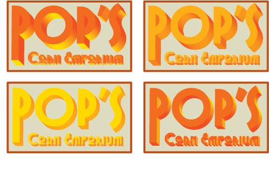 Now I see why people get paid just to make logos for companies... so many small tweaks here and there changes the whole feel of it.
So here are some variations on what I thought might have been the final logo. I'm liking the top right one... for now.
Possible Final Logo

I think we're getting closer. The font's good, the spacing's good... now it's just wondering about the exact colors and thickness of the letters.
Updated Logos

I'm trying to get the logo to have a feel of antiquity with a touch or modernism... ugh, did that sound pretentious.
Take two... I want something that looks cool, new and old at the same time.
These particular fonts are of the Art Deco variety, which would relate to the store's being in business since the 1930's. As for the color scheme so far, I'd like to use colors that resemble popcorn kernels, so maybe that's too "been there done that", but hey, I'm new at this.
Total Redesign For Pop's Corn Emporium

So the original idea of having a sparse, white home page with 7 or 8 popcorn kernels for Pop's Corn Emporium... that wasn't working, as it was too minimal for this particular company. I needed to show more humanity, love, familiarity, etc.
So here's the updated home page - a complete redesign. I really like having the idea of putting the navbar into the overhang. The little dots in the navbar will actually be popcorn kernels, and when you roll over each kernel, you'll get a big, white piece of popcorn.
The storefront look gives me the nice option to put the homepage divs containing the deals, specials, new flavors, etc., into the actual storefront windows.
I'm still wondering what to do with the sidewalk section. I might reduce the perspective of this and make it thinner, and possibly use this for the footer instead of putting the footer into the curb like I have now.
I want to keep the size of all the pages a consistent height and width, so I'll need to use scroll bars for the content pages. When the user goes to these second-level pages, a larger box will take the place of the previous storefront window panes from the homepage.
Sunday, November 20, 2011
Gettin' Those Logos To Pop

After perusing through, oh, about 200 different fonts, I started playing around with the various ones you see here. I'm hoping to show the class these different ideas and get some good feedback on what catches their eye, what colors work and what don't, and what I can improve and retouch until I get just the right one.
Monday, November 14, 2011
Pop's Corn Emporium - 1st Homepage Wireframe
 Here's my initial idea for the homepage for Pop's. I'd like to try out some animated stuff here and "pop" the kernels out from the screen if I can.
This is almost definitely too minimal a wireframe at this point, as I'm wondering if I need some kind of info at the bottom for any kind of footer. I'll likely skip using any boxlike elements for the site and keep things animated and "popping", of course.
Wednesday, November 9, 2011
Pop's Corn Emporium - Sitemap

The sitemap for Pop's won't be as complex as the one for the Danville Art League. Just keep things simple - products, history, locations, ordering online. No real need to make this site any more complicated than it has to be.
Project 2 Design Brief - Pop's Corn Emporium
For the second project in our web design class, I'll be researching, wireframing, and developing a website for one of my favorite (and OK, entirely fictional, but have fun with this) popcorn shops in the area:
Pop's Corn Emporium, in the historic downtown section of Geneva.
Now before we delve into design details, it's good to know the history of how Pop's Corn came to be, so let's check out Pop's history...
HISTORICAL BACKGROUND
Around the turn of the 20th century, Gilbert and Rosemary St. Germaine owned an expansive farm in northeastern DeKalb County, Illinois, northeast of the town of Sycamore. While Sycamore was known in those times as a manufacturing center - among Sycamore's early industries were Marsh Harvester Manufacturing, R. Ellwood Manufacturing, and Sycamore Preserve Works - the St. Germaines knew one thing, and one thing well... how to grow corn.
Gilbert and Rosemary's vast knowledge of growing different varieties of corn in DeKalb County was extremely helpful to other farmers in the area, and the St. Germaines were more than happy to share their expertise in farming matters to their neighbors. While many local farmers at that time would keep their secrets, well, secrets, Gilbert and Rosemary wanted the whole region to prosper, and prosper it did.
With the creation of the DeKalb County Farm Bureau in 1912, one of the first organizations of its kind, the entire corn crowing region of DeKalb County grew and strengthened, and the St. Germaines were at the heart of it. Little did they know that their generosity would be repaid in a huge way a few decades later.
Pop's Corn Emporium, in the historic downtown section of Geneva.
Now before we delve into design details, it's good to know the history of how Pop's Corn came to be, so let's check out Pop's history...
HISTORICAL BACKGROUND
Around the turn of the 20th century, Gilbert and Rosemary St. Germaine owned an expansive farm in northeastern DeKalb County, Illinois, northeast of the town of Sycamore. While Sycamore was known in those times as a manufacturing center - among Sycamore's early industries were Marsh Harvester Manufacturing, R. Ellwood Manufacturing, and Sycamore Preserve Works - the St. Germaines knew one thing, and one thing well... how to grow corn.
Gilbert and Rosemary's vast knowledge of growing different varieties of corn in DeKalb County was extremely helpful to other farmers in the area, and the St. Germaines were more than happy to share their expertise in farming matters to their neighbors. While many local farmers at that time would keep their secrets, well, secrets, Gilbert and Rosemary wanted the whole region to prosper, and prosper it did.
With the creation of the DeKalb County Farm Bureau in 1912, one of the first organizations of its kind, the entire corn crowing region of DeKalb County grew and strengthened, and the St. Germaines were at the heart of it. Little did they know that their generosity would be repaid in a huge way a few decades later.
Monday, October 31, 2011
Carving up some fun designs...


Happy Halloween, folks! As a fun diversion to the usual grind of schoolwork, lemme show you some fun pumpkin carving I did last night. After some time on the internet, my kids and I picked out some neat templates to use on this year's pumpkins.
I hadn't tried the technique of shaving before, so I was happily content with how the Angry Bird's reddish color ended up.
Now I've done it... I'm gonna have to go above and beyond for next year.
Monday, October 3, 2011
New and Improved Version


After lots of good feedback in today's class, here are the latest updated Photoshop mocks. To lessen the boxy look but keep my original idea, I've redesigned some of these boxes to have the same color as the main background. The three headlines now seem to fill in an empty hole in the background, instead of laying on top of another box.
Also, the hierarchy's more defined here. In the previous mockup, I had everything at about the same size. Now, the artist spotlight's featured more prominently, with the headlines shrunk down a little as well.
The navbar's also got some color changes, as I've dumped the teal look in favor of another eye trick, making the little navbar items appear to fill in more background holes.
The artist spotlight page has also been tweaked, with the artwork grouped a little better and larger as well dumping a few decorative boxes. I've still got a lengthy bio copy, but I don't know if making this a two-column div will make the text too small here.
Thursday, September 29, 2011
Lookin' For Feedback


Alrighty... since I didn't get the chance to show my updated Photoshop mocks in class on Wednesday, I'd like to get some feedback if possible before Monday. So go ahead, take a peek at the two screenshots, and tell me what you think. I left off the Google Chrome template so you could see the whole page more cleanly.
Wednesday, September 21, 2011
Guess Who's Redesigning Their Website?
 So maybe someone leaked out the word that C.O.D. was taking dead aim at the uncultured Art League sites infesting our state, as the Danville Art League just wrote this on their Facebook wall this past Sunday:
"DAL is working on a NEW WEBSITE! What NEW FEATURES would you like to see implemented on it?"
Well, since they're asking... I sent them a link to my blog here, so they can check out the homepage mockup at left, via Photoshop.
Wednesday, September 14, 2011
Web Page Sketches And Logos

Here are some quick sketches of how the home page and Featured Artist pages will be composed. I didn't stray much at all from my earlier drafts, but I did add an artist directory to the second page. One suggestion I took from the classroom feedback was to minimize the bottom navbar/footer. No need to have that navbar the same size as the one on top.
I'll also add to the featured artist page a link to that artist's own website if there is one - it'd be a nice feature to have, so people could look further into a particular artist's catalog of work. I don't want to show the artist's entire collection here... just keep it to three main pieces. I'm mentioning this here, as I forgot to add that to the sketch at left.
Gridwise, this won't be too difficult to arrange once I get started on that. However, I would like to try and extend the man navbar a bit further out on the sides than the rest of the page, just to break up the total box look.
As for the logos, I'm not sold on any one of the few logos I've sketched out so far. I'll really need to dig into the font catalog to pick out something that'll fit with the city of Danville. It's a rural community, nestled east of Champaign, and very close to the Indiana border. So in other words, I'll be looking for a more homey and antique font than one that's polished and sleek. I don't want anything TOO antique, or it'll give the impression the Art League's filled with grandmothers and retirees, which is definitely not the case here.
Wednesday, September 7, 2011
The Art League Homepage & Featured Artist Page Wireframes
Here are some quick sketches of what I'm planning to do for the Danville Art League homepage and Featured Artist page. Nothing really fancy in the way of overloading the pages - just keeping it simple, keeping it clean, and keeping it to the point. The colors are just used now for clarity, so I'll be tweaking that as I go along.
Same thing for the font you see here... right now, I'm just pointing out where things will be, so I'm not too concerned about fonts, pics or colors just yet. This is just the wireframe of where I'd like everything to be positioned.


Same thing for the font you see here... right now, I'm just pointing out where things will be, so I'm not too concerned about fonts, pics or colors just yet. This is just the wireframe of where I'd like everything to be positioned.


Wednesday, August 31, 2011
Making Quick Sitemaps Online

This little site might just be the fastest way to build a sitemap, and it's all online and free. SlickPlan is a web-based flowchart generator that's built to do one thing - make those flowcharts and sitemaps about as easily and quickly as you can.
Subscribe to:
Posts (Atom)